Are you looking to boost your data analysis skills and solidify your understanding of scatter plots? Then look no further! This Scatter Plot Practice Worksheet is designed to help you master the art of interpreting, creating, and analyzing these valuable data visualizations. Scatter plots are fundamental tools in statistics, allowing us to explore the relationship between two variables and identify potential correlations. Whether you’re a student learning the basics, a professional looking to sharpen your analytical abilities, or simply curious about data representation, this worksheet offers a structured and engaging approach to practice.
The worksheet presents a series of scenarios, each providing data for two different variables. Your task is to:
* **Create Scatter Plots:** Using the provided data, plot the points accurately on a graph. Remember to label your axes appropriately and choose a suitable scale for clear representation.
* **Interpret Scatter Plots:** Analyze existing scatter plots to identify patterns, trends, and outliers. Determine if there’s a positive, negative, or no correlation between the variables.
* **Draw Lines of Best Fit:** For plots exhibiting a linear trend, draw a line of best fit. This line should represent the general direction of the data and minimize the distance between the line and the points.
* **Interpret the Slope and Intercept:** Understand the meaning of the slope and y-intercept of the line of best fit in the context of the variables being analyzed. What do these values tell you about the relationship between the two variables?
* **Identify Outliers:** Recognize and explain the potential impact of outliers on the overall interpretation of the scatter plot.
This practice is crucial for developing a strong intuitive understanding of data analysis. By working through various examples, you’ll become more confident in your ability to extract meaningful insights from data presented in this visual format. So, grab your graph paper, pencils, and calculators, and let’s dive into the world of scatter plots!
Answers to Scatter Plot Practice Worksheet
Below are the answers to a sample Scatter Plot Practice Worksheet. Note that answers involving drawing lines of best fit may have slight variations depending on individual judgement. The explanations aim to guide you through the reasoning process.
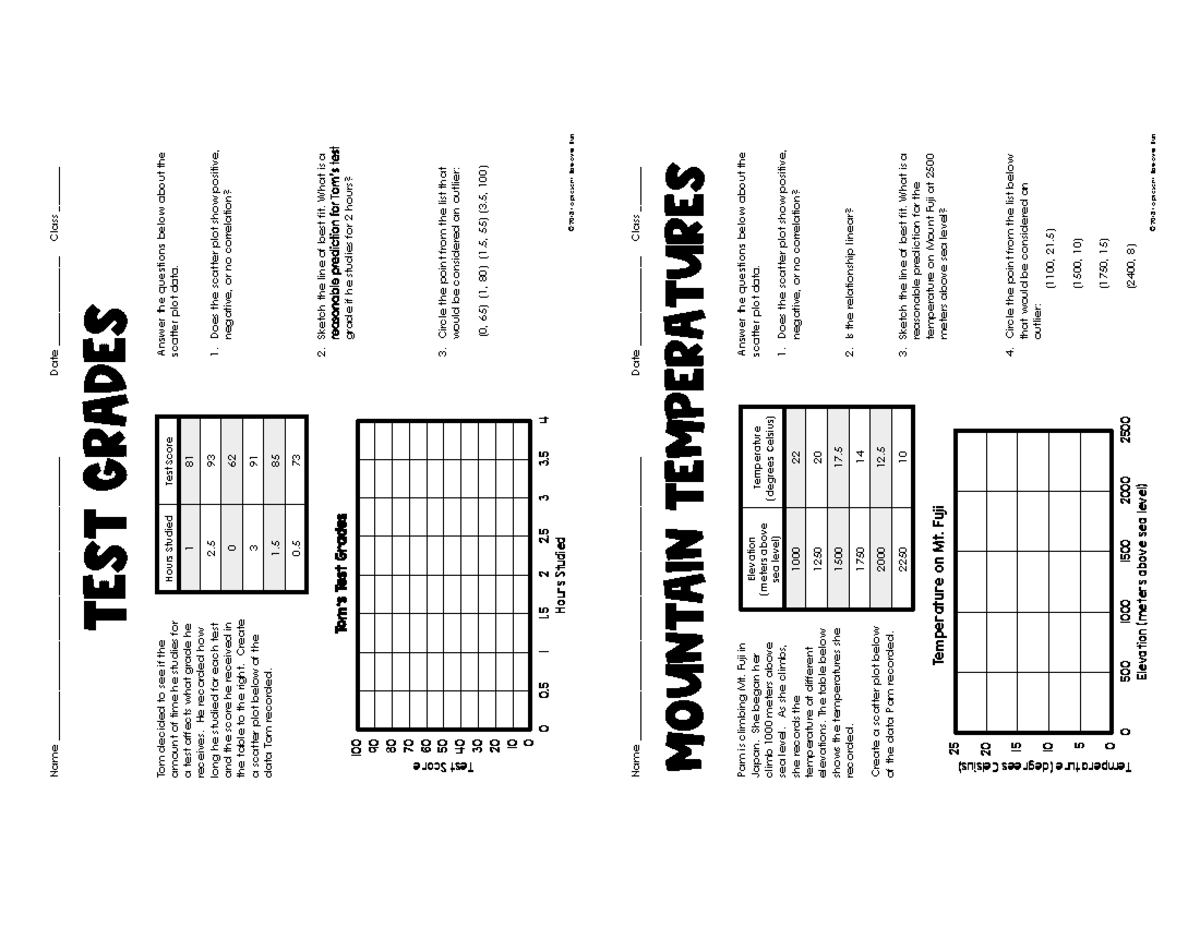
Scenario 1: Hours Studied vs. Exam Score
Data: Hours Studied (x): 1, 2, 3, 4, 5, 6, 7, 8, 9, 10. Exam Score (y): 55, 60, 65, 70, 75, 80, 85, 90, 95, 100
- **Scatter Plot:** The scatter plot will show a clear upward trend. As the number of hours studied increases, the exam score also increases.
- **Correlation:** There is a strong positive correlation between hours studied and exam score.
- **Line of Best Fit:** A line of best fit can be drawn through the points, closely following the upward trend. It should pass roughly through the point (5, 75) and (10,100)
- **Slope and Intercept:** The slope of the line will be positive, indicating that for each additional hour of study, the exam score tends to increase. The y-intercept indicates the estimated exam score for someone who doesn’t study at all (0 hours).
- **Outliers:** There are no obvious outliers in this data set. All points seem to fall relatively close to the best fit line.
Scenario 2: Temperature vs. Ice Cream Sales
Data: Temperature (x): 60, 65, 70, 75, 80, 85, 90, 95, 100. Ice Cream Sales (y): 5, 10, 15, 20, 25, 30, 35, 40, 45
- **Scatter Plot:** The scatter plot will show an upward trend, similar to the previous scenario. As the temperature increases, ice cream sales also increase.
- **Correlation:** There is a strong positive correlation between temperature and ice cream sales. People are more likely to buy ice cream when it’s warmer.
- **Line of Best Fit:** A line of best fit can be drawn through the points, demonstrating the upward trend. It should be close to the point (70, 15) and (90, 35).
- **Slope and Intercept:** The positive slope indicates that for each degree increase in temperature, ice cream sales tend to increase. The y-intercept indicates the estimated ice cream sales at a very low temperature.
- **Outliers:** Again, no obvious outliers present. The data forms a linear fashion.
Scenario 3: Number of Movies Watched vs. Grade in Math
Data: Movies Watched (x): 1, 2, 3, 4, 5, 6, 7, 8, 9, 10. Math Grade (y): 95, 90, 85, 80, 75, 70, 65, 60, 55, 50
- **Scatter Plot:** The scatter plot will show a downward trend. As the number of movies watched increases, the math grade decreases.
- **Correlation:** There is a strong negative correlation between the number of movies watched and the math grade. This suggests that spending more time watching movies might negatively impact academic performance.
- **Line of Best Fit:** A line of best fit can be drawn through the points, following the downward trend. Roughly through points (3, 85) and (8,60)
- **Slope and Intercept:** The slope of the line will be negative, indicating a decrease in grade for each additional movie watched. The y-intercept represents the estimated math grade for someone who doesn’t watch any movies.
- **Outliers:** A possible outlier could be a student who watches a large number of movies but still maintains a high grade, or conversely, someone who watches very few movies but has a low grade.
Scenario 4: Shoe Size vs. IQ
Data: Shoe Size (x): 6, 7, 8, 9, 10, 11, 12, 13, 14. IQ (y): 100, 105, 95, 110, 102, 98, 108, 104, 96
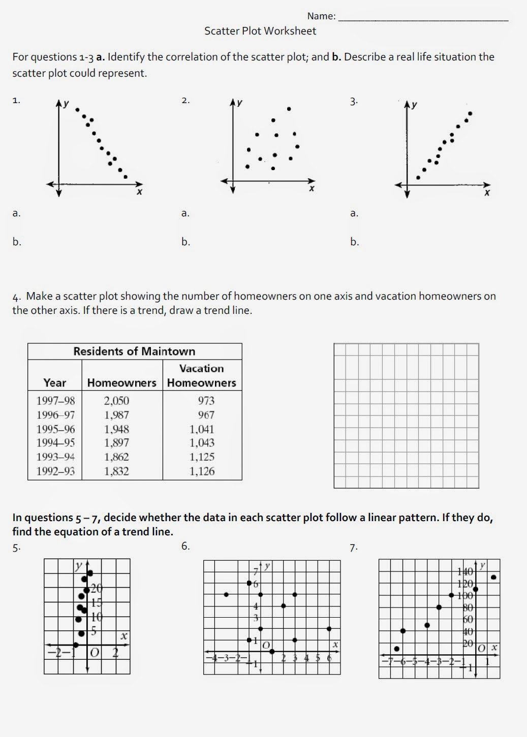
- **Scatter Plot:** The scatter plot will show no discernible trend. The points will be scattered randomly without a clear upward or downward direction.
- **Correlation:** There is no significant correlation between shoe size and IQ. These two variables are likely unrelated.
- **Line of Best Fit:** A horizontal line could be drawn through the middle of the points, representing the average IQ.
- **Slope and Intercept:** The slope of the line will be close to zero, indicating no change in IQ as shoe size increases. The y-intercept represents the average IQ of the sample.
- **Outliers:** Any points that are significantly higher or lower than the general cluster of points could be considered outliers.
Remember that drawing the line of best fit is a subjective exercise and its accuracy can depend on your careful observation and judgement. The answers provided are guides, and slight variations are expected. The key is to understand the underlying principles of correlation and how it is visually represented on a scatter plot. Happy analyzing!
If you are searching about M&Ms in math class? Yes, please! What a tasty way to practice with you’ve came to the right page. We have 20 Images about M&Ms in math class? Yes, please! What a tasty way to practice with like Scatter Plot Practice Worksheet Unique Quiz & Worksheet Interpreting, Scatter Plot Correlation Worksheet – E-streetlight.com and also Scatter Plot Correlation Worksheet – E-streetlight.com. Read more:
M&Ms In Math Class? Yes, Please! What A Tasty Way To Practice With

www.pinterest.es
Free Scatter Plots And Trend Lines Worksheet Answers, Download Free

worksheets.clipart-library.com
Scatter Plot Practice Handout – Name
www.studocu.com
Scatter Plot Practice Worksheet Unique Quiz & Worksheet Interpreting
chessmuseum.org
Scatter Plots Notes And Worksheets – Lindsay Bowden – Worksheets Library

worksheets.clipart-library.com
Scatterplot Worksheet – Printable Word Searches

davida.davivienda.com
Scatter Plot Correlation Worksheet – E-streetlight.com
www.e-streetlight.com
Scatter Plot Worksheet With Answers – Ame.my.id
ame.my.id
Scatter Plot Practice Worksheet – Ame.my.id
ame.my.id
Excel Scatter Plot Template

ar.inspiredpencil.com
Unit 4 Worksheet #1 Intro To Correlation Correlation: A To

worksheets.clipart-library.com
SOLUTION: Practice Scatter Plots And Lines Of Best Fit Worksheet

worksheets.clipart-library.com
Scatter Graphs Textbook Exercise – Corbettmaths – Worksheets Library

worksheets.clipart-library.com
Scatter Plot Correlation Worksheet – Hilovertical
hilovertical.weebly.com
Correlation Scatter Plot Examples – Booyboss
booyboss.weebly.com
Mr. Matt's Math Classes: Assignment – Scatter Plot Worksheet
mattteachmath.blogspot.com
How To Make A Scatter Plot In Excel With Two Sets Of Data – OffiDocs

www.offidocs.com
Practice With Scatter Plots Worksheet Answer Key

subjectverbagreementworksheets.blogspot.com
Scatter Plots: Line Of Best Fit Worksheet | 8th Grade PDF Worksheets

worksheets.clipart-library.com
Scatter Plot Worksheet Printable Escolagersonalvesgui – Vrogue.co
www.vrogue.co
Scatter plot correlation worksheet – e-streetlight.com. scatter plots notes and worksheets. Scatter plot correlation worksheet